Analyzing My Runs
For a while now, I’ve been thinking about how interesting it would be to look at data on my running habits. Depending on the time of year and some other factors, I probably run 1-4 times a week, and I’ve been running semi-regularly since college.
For the vast majority of that time, I’ve recorded my runs in Under Armour’s MapMyRun app. It’s a bit buggy and feels non-native, but it has a good Apple Watch app and collects the information I need fairly reliably.
Getting the Data
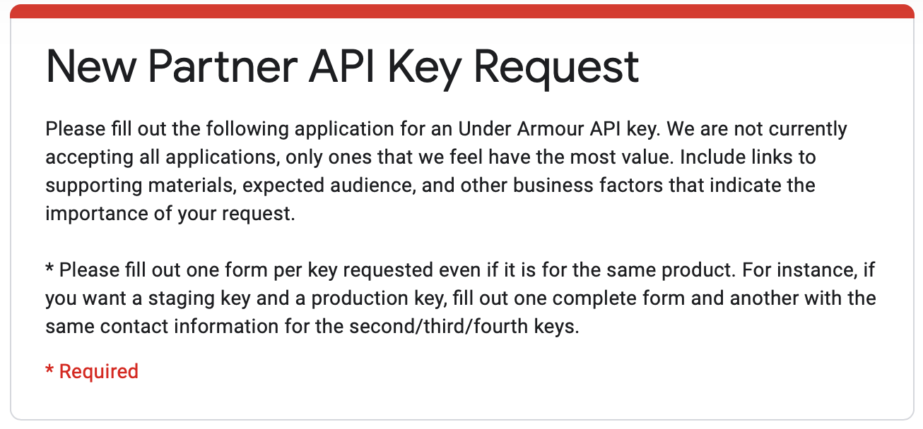
So it was pretty clear to me that the information I wanted was all there, in the MapMyRun database. But I figured extracting it would be complicated, certainly requiring a few API calls and some fighting with ugly returned JSON. When I finally investigated the API for MapMyFitness (the general term for the family of Under Armour’s fitness-tracking apps), I discovered that it required an API key, and an API key required approval, and UA was apparently not just granting them willy-nilly.
Luckily this roadblock turned out to be a blessing in disguise. Desperate for any other way to get at my data, I simply googled “download mapmyfitness data” and found an excellent help page1 that explained how to download all your data as a single, highly-structured and well-labeled CSV. Big props to Under Armour for having such open access for users to get their data! They’ve definitely engendered a lot of loyalty from me – knowing that I can get an archive of my data anytime is very valuable for a tech nerd.
Summary Insights
CSV in hand, I started some analysis of my last four years of running data. My very first recorded run was January 17, 2016, which would be during my final year of college. In all, I had 262 logged runs.
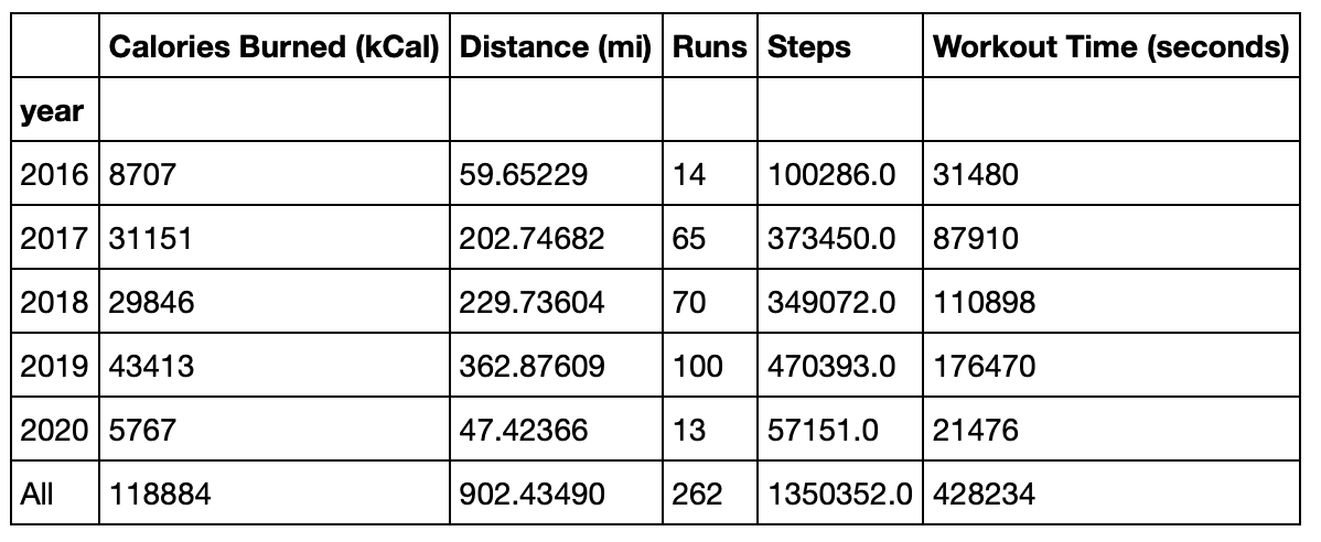
I’ve logged 119 hours (428234 / 60 / 60) and 900 miles of running – pretty wild numbers to think about. 300 of those miles (and 36 hours) were indoor runs, meaning I’ve spent a ridiculous amount of time on a treadmill.
One specific thing of interest to me was the distribution of my runs over time. I could have used a bar plot to show the count of runs by month, but the stats nerds out there will know that this is a good case for a density plot. Density plots are basically a way of smoothing out a histogram so that decisions about where to divide the bins don’t affect how the data appears to be structured. I could have made a density plot of the dates of my runs, but I also wanted to factor in distance – an 8-mile run should have twice the effect of a 4-miler. To accomplish that, I counted each run in proportion to the distance traveled on that run (it took a little hacking in the end, code here). But the result was exactly what I wanted.
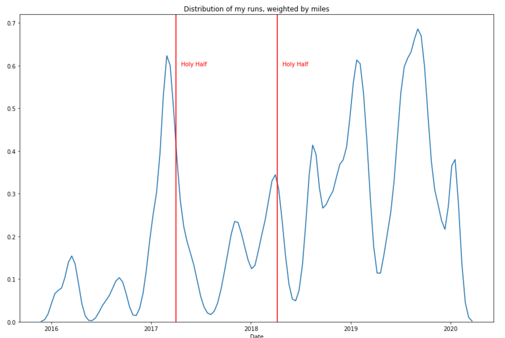
You can think of this as the density of mileage I covered over given time frames. As you can see, there’s a huge amount of variation: in 2016, I wasn’t running that many miles at any point. In 2017, I ran a lot early in the year and then my distance plummeted to almost nothing. These peaks and valleys aren’t purely coincidental though; I was training for half marathons in 2017 and 2018 (and also in 2019 actually, but I changed my mind in the final weeks). I added lines to show the dates of those half marathons, and it’s quite clear how they affected my mileage.
The full spread of my runs is interesting too – there’s a lot of variation in mileage and speed.

Adding a line of best fit to this chart reveals that the relationship between distance and per-mile speed isn’t all that strong.

Modeling Speed
Intrigued by this (non-)relationship, I tried modeling my speed more rigorously. I hypothesized that the information about the runs that would be most predictive would be distance traveled, date, and whether the run was indoor or outdoor.
I iterated through several different modeling approaches (code here) and eventually found the most predictive approach to be transforming the date of the run into the days until the next April 1 – because my annual half marathon was usually around then. Obviously I’m omitting a fair amount of banging-my-head-against-the-wall during this process, but with that new variable I built a somewhat predictive regression.
Of course, my main interest in the model was inferential; I’ll never be in a situation where I need to predict how fast I’ll be running. Well, never say never, but that doesn’t seem terribly useful. Instead, I’d like to see how these factors affect my speed.
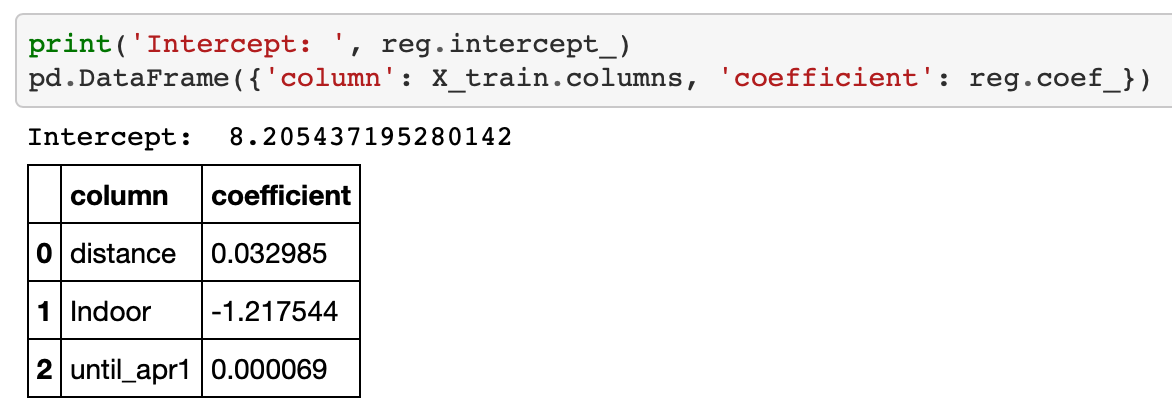
Basically, the model said my “base” pace was 8.2 minutes/mile, but:
- Running indoors cut about 1.2 minutes per mile off my time.
- Running an additional mile added about 0.03 minutes per mile to my time (about 0.6 seconds).
- The more days until the coming April 1, the slower I ran – very slightly. 90 days away that would add .006 minutes/mile (0.37 seconds), 180 days away would add 0.012 minutes/mile (0.75 seconds), and 365 days away that would add 0.025 minutes/mile (1.5 seconds).
What’s all that mean? Running farther or at different times of the year really has had very little impact on my speed; running indoors is by far the most substantial. Why? I have some suspicions.
- There are no hills when running on a treadmill.
- I tend to set very clear goals when running on the treadmill. Today I want to run X miles in Y minutes.
- On my outdoor runs, I sometimes stop at intersections or pause to look around (or to check a map when I get lost).
- When training for a race, I run on the treadmill much more than I would otherwise. That means that in the periods where I’m training a lot – and getting faster – I’m spending more time on a treadmill.
- Last, a complicated one: I am a lot more likely to run longer distances when I’m in good conditioning. This means that the slowdown associated with running farther is often offset by my increased level of fitness at that time. This keeps distance from being very powerful in making predictions about speed.
There’s definitely more rigor I could have applied in the modeling process, and with more work I may have been able to create something a bit more predictive. Modeling this as a time series could have been extremely powerful – each run’s speed is probably quite closely associated with the speed of the run before it. But for a few hours of work, I’m pretty happy with it.
Wrap-up
This project was a lot of fun. One part of data science that’s been disappointing to me is how challenging it is to find practical applications in one’s daily life. How often do you have longitudinal data on your life? Getting at my running data provided an ideal chance to use some of my skills on something that matters to me personally.
Going forward, I imagine I’ll download a new archive at some point and rerun this analysis on it. I would love to automate the data pull so I could build a recurring process with it. I haven’t investigated that yet but I’m sure I will – however, I expect it to be pretty challenging, as the download requires interactively logging in through the browser.
Did I learn anything useful about my running habits? Not really. It’s interesting how much they’ve fluctuated over time, and I’m really blown away by seeing my total distance and time. But beyond the summary statistics, the only meaningful takeaway was that time of year and distance don’t have a big impact on my speed.
If you’re interested in seeing the code, check out the GitHub repo. If I do indeed come back to this project, I’ll add/update code there. And if you do any similar projects with fitness data, I’d love to hear about them.
-
Unfortunately, as of February 2024 this help page has been taken down and I haven’t found similar documentation anywhere else. However, the direct link to download your data still works fine: https://www.mapmyfitness.com/workout/export/csv ↩︎